An independent journal on horological aesthetics · VC.P

Understanding the Aesthetics of Wristwatches

From a VC.P Perspective
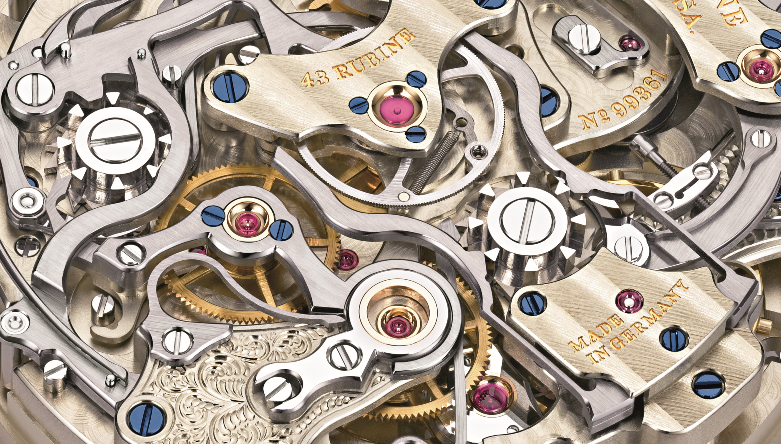
A. Lange & Söhne watch detail
Credit: A. Lange & Söhne
VC.P Selection

Three stories worth your attention today.

  1. 01

    Nomos turns its dials into an atelier

    Nomos’s made-to-order Twice Unique collection treats five familiar models as canvases for nine artist-led dial designs. Each commission pairs a steel watch with an 18K gold counterpart, favouring handwork and individuality over conventional limited-edition logic.

    Fratello ↗

  2. 02

    The GPHG finalists set the stage for November

    The 2026 GPHG finalists are now public ahead of the November 7 ceremony. Revised, non-gendered categories and a new jury president signal an awards institution seeking a broader global audience—while giving smaller brands a meaningful stage.

    Hodinkee ↗

  3. 03

    Rolex sends four unique Daytonas to charity auction

    Four one-off, season-inspired gem-set Daytonas will be sold separately by Phillips in London on September 28. The proceeds support the Federer Foundation and Re:wild, placing a rare public Rolex project at the intersection of craftsmanship and philanthropy.

    Fratello ↗

View Archive
00 — Opening

Introduction

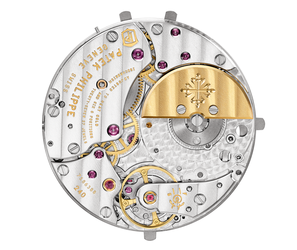
Patek Philippe movement
Credit: Patek Philippe

This is an opinion-based project recording VC.P’s taste in mechanical wristwatches. It is neither academic writing nor professional commentary on wristwatch aesthetics. Written from his personal perspective, it offers one way to understand timepieces comprehensively. He does not position himself as a watch collector; that is not a title this project seeks to claim. As a passionate individual who has been enthusiastic about watches for more than ten years, he discusses his own views on the beauty of timepieces. This work aims to inspire watch lovers in their approach to examining aesthetics, particularly the construction of mechanical wristwatches and the ideologies embedded within them.

01 — A framework for looking

Components of a Wristwatch

To understand wristwatch aesthetics, the first step is to understand all the components we need to consider when evaluating them—in other words, where should we look when we want to know whether a watch is “beautiful”? This is a crucial foundation. VC.P’s aim is not simply to tell you why a watch is beautiful at first glance, but to encourage you to analyze every detail and understand why each one matters aesthetically.

Only the macro components visible in a watch’s appearance are listed here. This does not include, for instance, the movement (which is sometimes not visible) or the crown (a small part of the larger component, the “watch head”). From this perspective, a wristwatch can typically be divided into:

  1. The watch head
  2. The strap or bracelet
  3. The clasp or buckle
  4. The parts connecting the strap or bracelet to the watch head
  5. The parts connecting the strap or bracelet to the clasp or buckle

Far too many people judge a watch from a single aspect, overlooking essential parts of the whole. The first three points may be familiar, but this framework highlights the fourth and fifth, which are often overlooked. They are irreplaceable elements; when a watch feels aesthetically “weird,” the problem is likely to lie in these connecting parts.

Rolex watch and bracelet
Credit: Rolex
02 — The band / bracelet

The Watch Band & Bracelet

VC.P begins with the watch band or bracelet because he considers it responsible for more than 50% of the entire beauty of a wristwatch. This may sound exaggerated, but analyzing it is not simply a matter of looking at the band or bracelet itself; more significantly, it means considering how it interacts with the watch head and the clasp or buckle as a whole.

The vast number of designs throughout history cannot all be covered here. The aim is to propose general concepts that function as a “baseline”—principles that, in his view, a designer should follow to maintain a watch’s aesthetics.

“An ugly watch head can often be rescued by an appropriate band or bracelet. An ugly band or bracelet, however, cannot be rescued by the watch head.”

Watch bracelets

All metal constructions with a link structure.

Watch straps

Strap-like structures, including leather, fabric and rubber.

2.1

Watch Bracelets

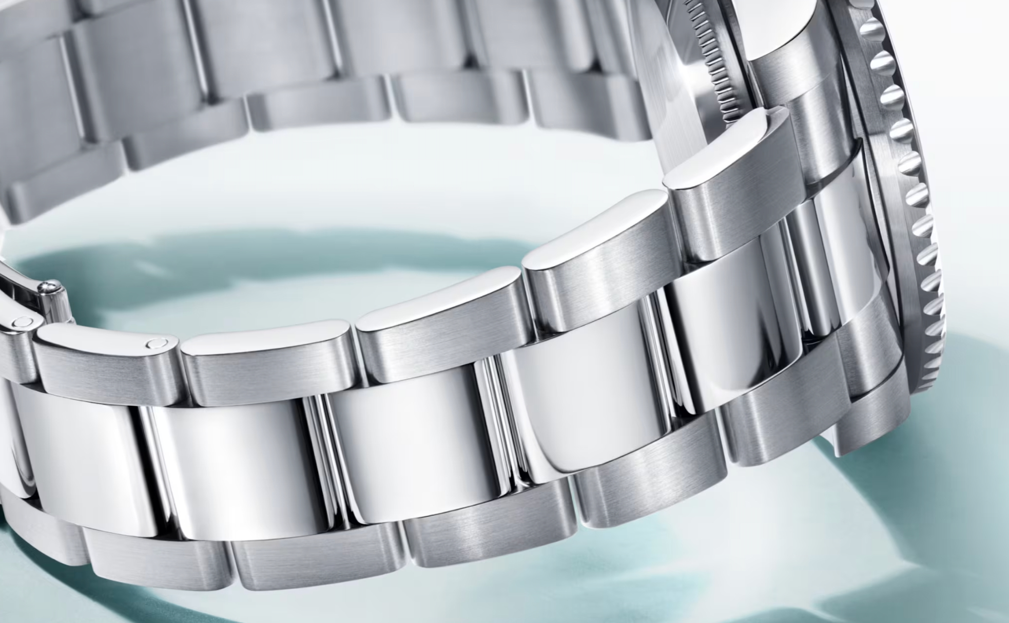
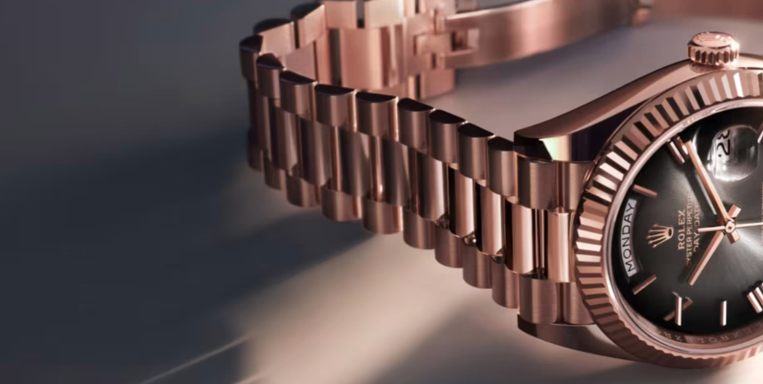
The most crucial element defining how beautiful or appropriate a bracelet is, in VC.P’s view, is its taper: the links become progressively narrower from the watch head toward the clasp. If the end link—the part connecting the watch head and bracelet—is 20 mm wide, the link at the clasp should be 18 mm or 16 mm. The exact number does not matter. What matters is the tapering flow. Without it, your watch will look like a chain around your wrist. A difference of between 2 mm and 4 mm is considered appropriate.

The end link’s primary aesthetic function is to transition from the “squareness” of the bracelet links to the “roundness” of the watch head—or to whatever shape the case may take. The point is to make the change gradual.

This returns us to the ideology of “flow.” All components should interconnect, with no awkward gaps in the transitions from watch head to bracelet or bracelet to clasp. The end link is therefore an important adapter between bracelet and case.
Rolex bracelet end links
Credit: Rolex
02.2 — Leather straps
2.2

Watch Straps

VC.P focuses mainly on leather watch straps, which, in his view, require the most attention to detail to form a decent design. Leather easily exposes the “cheapness” of a strap when one or more details are missed. NATO and rubber straps are recognized but not included here, even though some points about leather also apply to them.

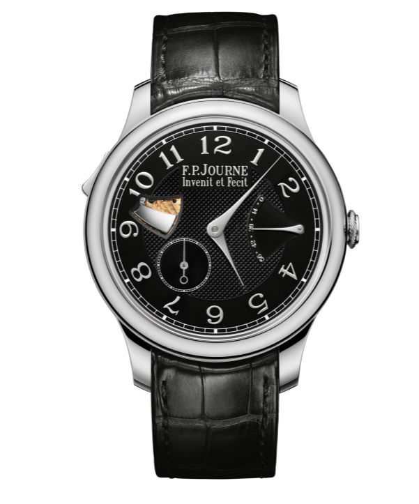
Leather straps must follow the tapering flow and connect smoothly to the watch head. If the spring-bar end is 20 mm wide, the buckle end should be between 16 and 18 mm. Unlike bracelets, conventional straps do not have end links, so there will be a gap between strap and case, except in special designs such as the Cartier Santos. It is an art to reduce this gap. One solution is to position the spring-bar holes closer to the case, or design shorter lugs. Another is a curved spring bar with a correspondingly curved strap end. F.P. Journe is an example: its leather straps feature a curved connection that contributes greatly to the watch’s aesthetics.

F.P. Journe curved-end strap
Credit: F.P. Journe
Hand-stitched watch strap
Credit: The Strap Tailor
2.2.1

Stitching

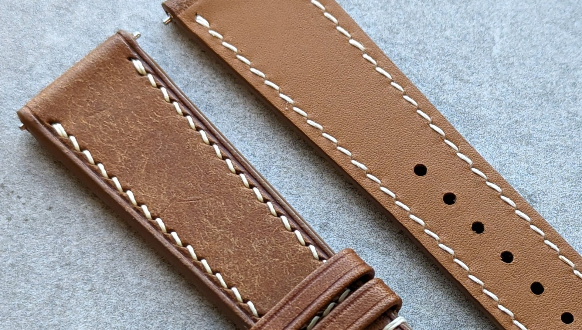
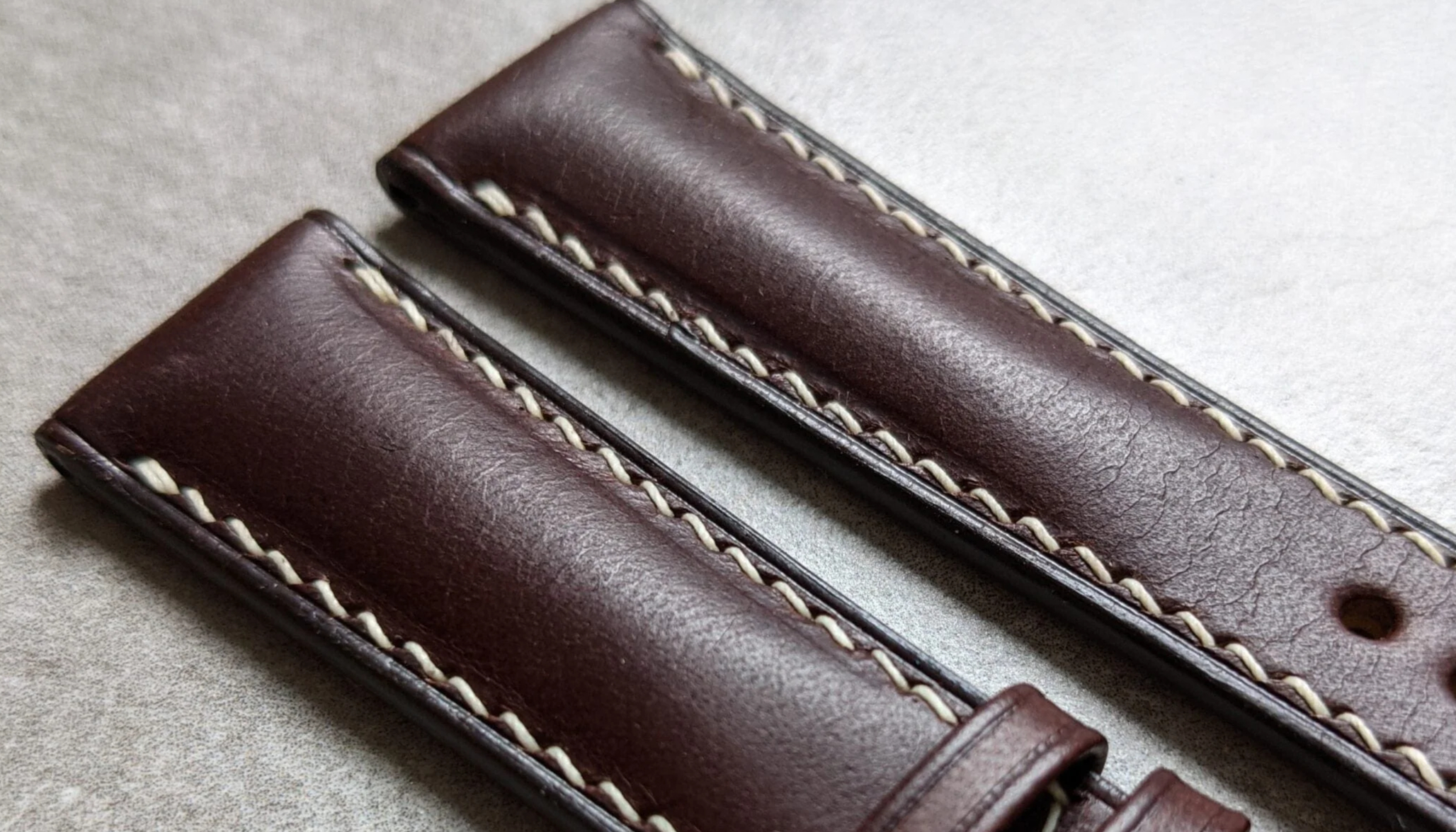
Stitching is crucial to leather-strap aesthetics. First, make sure it has the same color on the front and back. Matching thread indicates that stitching was the final production stage, after gluing, with no paint applied afterward. Also make sure the stitching is not perfectly straight, but slanted in a “Z” pattern. This results from hand stitching, in which pricking irons punch angled holes before sewing, and makes the strap look significantly more premium.

2.2.2

Padding

Padding strongly affects a strap’s aesthetics. Makers often place it between two stitched pieces of leather, producing a raised surface and greater thickness. Whatever its purpose, padding of this kind makes the strap look out of proportion perhaps 80% of the time. Most watch heads are relatively flat; a heavily padded, almost “sausage-like” strap breaks that flow. Padding also delays the leather’s adaptation to the wrist.

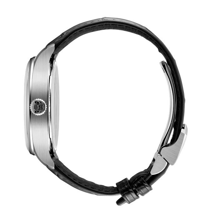
A good leather strap should therefore have little or no padding, leaving its surface slightly curved or flat. But it should not be too thin: an ultra-thin strap may fail to continue the flow of the watch head. As a rough proportion, the strap should be no more than half, and no less than one quarter, of the watch head’s thickness.

Side profile of a leather strap
Credit: The Strap Tailor
Leather strap and free keeper
Credit: The Strap Tailor
2.2.3

The Free Keeper

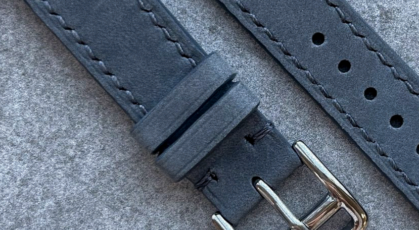
The last element worth mentioning is the free keeper, found on almost all straps with a pin buckle. There are typically two keepers: the first, near the buckle, is fixed; the second moves freely. It must be tight enough. If too loose, it will not stay in position and will appear to stick out from the strap’s flow—like an ill-fitting suit.

Place it so the tail does not project too far, but not so close to the end that the tail falls out. Strap tips usually form a V-shape; leave the keeper just before that shape begins, often 1–1.5 cm from the end. Its position matters every time you put on the watch.

04 — VC.P’s Dictum Board

Notes to keep in mind.

“Time may not exist, but timepieces surely do.” — VC.P
“Scratches are record players of memories.” — VC.P
“Some people see a watch’s value in money; others, in knowledge.” — VC.P